I am a traditionalist. The colours are wrong. The Eagles old unis look better then the new - is that even green? The logo changes are terrible the Falcons for eg.
I like traditional unis. The Vikes have had the same look since day one.
If you have Madden 2004 you can compare the teams old and new uniforms and the old ones all look better to me. Even the Bucs atrocious Orange Pirate Boy.
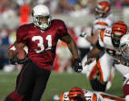
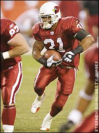
I like the idea of red and black uniforms (plus it goes with the color theme of the logo better than the current uniforms). They look cool in Madden It would have to wait for the new stadium since wearing black isn't a smart thing to do in AZ outdoors...
The all red uniforms are cool. If it was up to me, the all red would be the away uniform and the traditional red and white would be the home uniform.
I would be for a slight logo change to make the Cardinal look 'meaner' like the Sea Hawks and Eagles. As to me atleast, the logo looks slightly out dated.
Not sure what is up with the grey face masks! Whats the point of them? They don't seem to tie into the scheme of the uniform at all.
I would be for a slight logo change to make the Cardinal look 'meaner' like the Sea Hawks and Eagles. As to me atleast, the logo looks slightly out dated.
If you have Madden 2004 you can compare the teams old and new uniforms and the old ones all look better to me. Even the Bucs atrocious Orange Pirate Boy.
I am a traditionalist. The colours are wrong. The Eagles old unis look better then the new - is that even green? The logo changes are terrible the Falcons for eg.
I like traditional unis. The Vikes have had the same look since day one.
I am 38 from MO and have been a Cardinal fan since the mid 70s glory days. The logo and uniforms created fond memories of great Sunday afternoons rooting for the Cardinals in their close battles with the Cowboys and Redskins. They have not been very good since the Coryell days. They had slight upturn with Hanifan and were very exciting then with Lomax.
The Packers, Bears and others have had some very lean years and did not turn their back on the good of their tradition. I admire the classic look. You see highlight footage of teams back decades and the basic uniform is the same. Seahawks and Eagle changes were terrible. Who thought of idea of dark logo an dark helmet? It does not show up. I think the Cardinals should use black trim more like they used to do in the St. Louis and early AZ days. All white road uniforms with red and black trim looked good. The all red is terrible. Wearing a dark color pants and shirt makes it very tough to watch the game. Upper body and lower body blur together. I dont have that problem with white though. The idea of changing the logo or drastic uniform change would be the Big Red turning its back on its MO fans and its legacy. There is room for the Arizona Cardinals to have MO and AZ fans. They have been bad but they are the oldest team in the NFL. They predate the NFL. They have some good people and teams from the past. What is the deal with not retiring numbers of Cardinals in the Hall of Fame such as Dierdorf and Jackie Smith? Only team I know who does not retire Hall of Famers jerseys.


") It would have to wait for the new stadium since wearing black isn't a smart thing to do in AZ outdoors...
It would have to wait for the new stadium since wearing black isn't a smart thing to do in AZ outdoors...