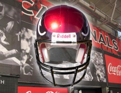
New Look For Cardinals Helmets

TheCardFan

Things have changed.
Joined
May 14, 2002
Posts
12,335
Reaction score
15,567
Location
Charlotte
badass i would change it in a heartbeat voted for one very similar when we did the new unis years ago, excellent work, maybe when the old man dies someone will step up and pay you for your design because it can not be improved on, and the yellow facemask incorporating the beak is the icing on the cake

I believe this is Jetsteam Greens design...I have seen his artwork and it is really good.
 

azsouthendzone

ASFN Addict
Joined
Feb 10, 2004
Posts
5,620
Reaction score
1,322
Then their design team should be fired for hinting at the nike swoosh.

Are you serious? Nike hasn't made an NFL jersey since before 2000. How are these two logos even related?

You must be registered for see images


You must be registered for see images
 

LoyaltyisaCurse

IF AND WHEN HEALTHY...
Joined
Aug 10, 2004
Posts
53,873
Reaction score
19,669
Location
CA
change the facemask to black and that is one sweet freaking helmet.
 

TruColor

Trombonist in Roger Goodell's Wedding Rcpt.
Joined
May 13, 2002
Posts
4,150
Reaction score
3,106
Location
Prescott, AZ
I believe this is Jetsteam Greens design...I have seen his artwork and it is really good.

Which I have already pointed out, and posted.

And, as I've also already pointed out, this is one of MANY very similar designs that I've been seeing for the past 15 years or so. Not original.

Even if the Cardinals were to adopt this look (God forbid), there's no way to even figure out who would get the credit for the original idea. It's been done over and over again.
 

Cheesebeef

ASFN IDOL
Supporting Member
Joined
Jan 2, 2003
Posts
92,165
Reaction score
70,365
Which I have already pointed out, and posted.

And, as I've also already pointed out, this is one of MANY very similar designs that I've been seeing for the past 15 years or so. Not original.

it may not be original, but it's definitely the best looking and most professional of all the different incarnations of this design IMO. The example you posted looked like it was drawn with crayon by a seven year old as opposed to what was posted in the this thread, which just looked awesome. I mean, how often do you actually see a majority of posters, darksiders and others agreeing as much as they have here?
 
Last edited:

Scott MS

Registered
Joined
Mar 8, 2004
Posts
4,144
Reaction score
15
help mold the Cardinals as the elite organization in the league


I think your helmet is awesome, but I wouldn't go as far as saying an "elite organization".
 

TheCardFan

Things have changed.
Joined
May 14, 2002
Posts
12,335
Reaction score
15,567
Location
Charlotte
Which I have already pointed out, and posted.

And, as I've also already pointed out, this is one of MANY very similar designs that I've been seeing for the past 15 years or so. Not original.

Even if the Cardinals were to adopt this look (God forbid), there's no way to even figure out who would get the credit for the original idea. It's been done over and over again.

I know Pantone...

I like the design but would like to know how this person came up with it. You have many dated examples and I want to make sure that nobody is taking an idea and calling it their own...not that I am the Logo Police or anything.
 

azsouthendzone

ASFN Addict
Joined
Feb 10, 2004
Posts
5,620
Reaction score
1,322
I guess if they ever adopted this, there would be a major lawsuit involving Jetstream Green and Strategos :eek:
 
OP
OP
S

Strategos

Newbie
Joined
Sep 3, 2007
Posts
2
Reaction score
0
Thank you guys for all the positive feedback. I came up with this design on my own and I have a copyright for it with the U.S. Copyright Office. The graphic that Pantone posted is the first time I seen it. My design is not the same as his, it is the same concept, but different design, so I know I have not infringed on anybody else's design.
The last two graphics I posted are of an actual helmet that I created, it is not a 3-D image.
 

TruColor

Trombonist in Roger Goodell's Wedding Rcpt.
Joined
May 13, 2002
Posts
4,150
Reaction score
3,106
Location
Prescott, AZ
it may not be original, but it's definitely the best looking and most professional of all the different incarnations of this design IMO. The example you posted looked like it was drawn with crayon by a seven year old as opposed to what was posted in the this thread, which just looked awesome. I mean, how often do you actually see a majority of posters, darksiders and others agreeing as much as they have here?

And you just insulted Jetstream Green.

:D

Honestly, I think a lot of you are just dazzled by the presentation. It's obviously a well-done Photoshop job, but it's a worn-out, tired concept that needs to be retired. And for the record - as I stated before - NFL Properties ALSO came up with the same thing, so there'd be no lawsuit. End of story.
 

Redsz

We do this together
Joined
Jan 21, 2004
Posts
4,917
Reaction score
2,524
Good concept. But I love our uni's and logo.

No need to change them.
 

Cheesebeef

ASFN IDOL
Supporting Member
Joined
Jan 2, 2003
Posts
92,165
Reaction score
70,365
And you just insulted Jetstream Green.

no more than others here ripping Stratego's idea. If you're gonna put art-work up somewhere's, you better expect any kind of feedback, good or bad.

:D

Honestly, I think a lot of you are just dazzled by the presentation. It's obviously a well-done Photoshop job, but it's a worn-out, tired concept that needs to be retired.

uh, who died and made you the king of all things cool un-wise? Ever think some of us just have different tastes than you do? There's obvious similarities between Green's and Stratego's designs, but there's obvious difference as well.

but like I and others said, the Cards would never go with something like this anyway.

good job anyway Stratego.
 

TheCardFan

Things have changed.
Joined
May 14, 2002
Posts
12,335
Reaction score
15,567
Location
Charlotte
Thank you guys for all the positive feedback. I came up with this design on my own and I have a copyright for it with the U.S. Copyright Office. The graphic that Pantone posted is the first time I seen it. My design is not the same as his, it is the same concept, but different design, so I know I have not infringed on anybody else's design.
The last two graphics I posted are of an actual helmet that I created, it is not a 3-D image.

So are you a Cardinal fan or Pantone's long lost twin brother (or both)?
 

TruColor

Trombonist in Roger Goodell's Wedding Rcpt.
Joined
May 13, 2002
Posts
4,150
Reaction score
3,106
Location
Prescott, AZ
uh, who died and made you the king of all things cool un-wise? Ever think some of us just have different tastes than you do? There's obvious similarities between Green's and Stratego's designs, but there's obvious difference as well.

I guess I'm just bewildered by the reaction here. I mean, we went over and over this concept back when the Cardinals unveiled their new logo. This isn't new. Yeah, Strategos' work is real nice, but it's far, far, far away from being an original idea. I've got another similar concept on my site (besides Jetstream's), and others on some of the other logos boards came up with the same thing.

I'm not trying to come down on Strategos (sorry!)...I'm just trying to be realistic about the whole thing.
 

TheCardFan

Things have changed.
Joined
May 14, 2002
Posts
12,335
Reaction score
15,567
Location
Charlotte
I guess I'm just bewildered by the reaction here. I mean, we went over and over this concept back when the Cardinals unveiled their new logo. This isn't new. Yeah, Strategos' work is real nice, but it's far, far, far away from being an original idea. I've got another similar concept on my site (besides Jetstream's), and others on some of the other logos boards came up with the same thing.

I'm not trying to come down on Strategos (sorry!)...I'm just trying to be realistic about the whole thing.

Do you have the one wit the eye and black helmet?

:deadhorse2:
 

Cheesebeef

ASFN IDOL
Supporting Member
Joined
Jan 2, 2003
Posts
92,165
Reaction score
70,365
I guess I'm just bewildered by the reaction here. I mean, we went over and over this concept back when the Cardinals unveiled their new logo. This isn't new. Yeah, Strategos' work is real nice, but it's far, far, far away from being an original idea. I've got another similar concept on my site (besides Jetstream's), and others on some of the other logos boards came up with the same thing.

I'm not trying to come down on Strategos (sorry!)...I'm just trying to be realistic about the whole thing.

you just seem a little bitter about the whole thing. Like you said, the presentation is nice, but it's a variation of something we've already seen, but in the artistic world, presentation is such a HUGE part of it, that when your given something like Green did (which looks very amateurish) as opposed to Stratego (nuanced and polished), I think it's easy to see why people who didn't go gagga before are impressed now.
 

TruColor

Trombonist in Roger Goodell's Wedding Rcpt.
Joined
May 13, 2002
Posts
4,150
Reaction score
3,106
Location
Prescott, AZ
you just seem a little bitter about the whole thing. Like you said, the presentation is nice, but it's a variation of something we've already seen, but in the artistic world, presentation is such a HUGE part of it, that when your given something like Green did (which looks very amateurish) as opposed to Stratego (nuanced and polished), I think it's easy to see why people who didn't go gagga before are impressed now.

Taking a step back, I can see where I've gone wrong here. I basically post on two message boards - this one, and Chris Creamer's Sports Logos Board. Sometimes, I forget the audience.

On Chris's board, we invariably get someone new to the sports logos/uniforms business who comes up with what may or may not be a nice concept. Sometimes the concept is good enough that someone else (who doesn't understand how all of this works) encourages the designer to "send in the design to the team". Then, the rest of us have to explain - again - how that is a waste of time, how they would need to work for a major design firm, be commissioned by a team or league, and/or actually work in the Properties division of one of the leagues to actually have a design reviewed legally. It's just frustrating to have to go through that explanation over and over again.

But that's not here; that's over on Chris's board. Here, concepts don't get posted too often, and nor should they really. I think I've let my frustration over what happens over there leak onto this board.

Bottom line: I apologize for being a pretentious little twit.

:D
 

Cheesebeef

ASFN IDOL
Supporting Member
Joined
Jan 2, 2003
Posts
92,165
Reaction score
70,365
Taking a step back, I can see where I've gone wrong here. I basically post on two message boards - this one, and Chris Creamer's Sports Logos Board. Sometimes, I forget the audience.

On Chris's board, we invariably get someone new to the sports logos/uniforms business who comes up with what may or may not be a nice concept. Sometimes the concept is good enough that someone else (who doesn't understand how all of this works) encourages the designer to "send in the design to the team". Then, the rest of us have to explain - again - how that is a waste of time, how they would need to work for a major design firm, be commissioned by a team or league, and/or actually work in the Properties division of one of the leagues to actually have a design reviewed legally. It's just frustrating to have to go through that explanation over and over again.

But that's not here; that's over on Chris's board. Here, concepts don't get posted too often, and nor should they really. I think I've let my frustration over what happens over there leak onto this board.

Bottom line: I apologize for being a pretentious little twit.

:D

that makes sense - it's all good Pantone!
 

Scott MS

Registered
Joined
Mar 8, 2004
Posts
4,144
Reaction score
15
Bottom line is that although it's a nice design and a bit of a novelty, we all know that the Cards won't be changing uniforms anytime soon. In fact, it was stated that Bidwill wanted to keep the helmets very traditional and carried over the grey facemask, only updating the tweaked bird head logo.

Only way you'll see a helmet change like that is after Bidwill sells the team.
 

1DS

Registered
Joined
May 12, 2005
Posts
1,147
Reaction score
0
Location
Maryland
Patone came up with this EXACT design right before the "new" logo was revieled. Right when speculation was at it's peak.

This is a clear knock-off, if not an exact copy.
 

English on tour

Eng-gur-land Eng-gur-land
Joined
Sep 4, 2004
Posts
4,263
Reaction score
49
Location
Whitley Bay, England
these helemts are based on the logo - so without the logo then the helmets dont make sense. catch-22 in my eyes.

looks cool though no the less :thumbup:
 

Staff online

Forum statistics

Threads
556,177
Posts
5,434,073
Members
6,329
Latest member
cardinals2025
Top